Showing posts with label fast. Show all posts
Showing posts with label fast. Show all posts
Monday, May 23, 2016
Event Poster
Labels:
doge,
fast,
illustrator,
pen tool,
skilife,
skillz,
suhdude,
vintage,
whatisthis,
whatup,
work
Tuesday, April 12, 2016
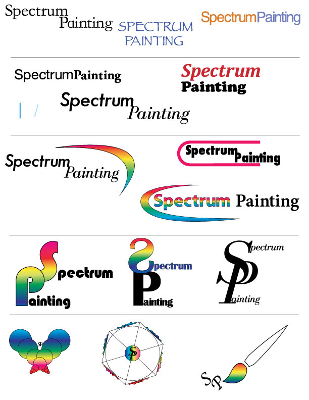
Logo Design and Development
Labels:
adobe,
bruh,
car,
datsun510,
doge,
fast,
illustrator,
skillz,
suhdude,
whatisthis,
whatup,
work
Friday, March 25, 2016
Portfolio Cover
Labels:
doge,
fast,
giant,
hard,
illustrator,
Iron Giant,
mario,
pen tool,
photoshop,
skillz,
suhdude,
vintage,
whatisthis,
whatup,
work
Monday, March 7, 2016
Design Typography Notes
"fonts are the clothing that out ideas wear."
- Legibility: choose classical time-tested typefaces
Helvetica, Times New Roman, Palatino, Baskerville
- Serif vs Sans Serif: Serif reads best at smaller sizes, can be complementary
- Font Variance: Too many fonts confuse the reader
- Definition: Fonts that are too similar cause ambiguity
- Readability: Use UPPER and lower case letters for optimum clarity
- Alignment: Left alignment reads easiest, consider eye flow as it moves down a page
- Emphasis: Use these tools with discretion and without disturbing eye flow
- Integrity: Avoid stretching or distorting type
- Weight: Strive for a sense of balance
- Kerning: Spacing between the letters
Thursday, March 3, 2016
Wednesday, March 2, 2016
Monday, February 29, 2016
Color Theory
Design
- You see ROYGBIV because its the visual color spectrum
- Pigment generated model is: Red, Yellow, Blue
- Light generated colors: Red, Green, Blue
- Pigment generated is lighter and light generated is brighter
Color Mixing
- RGB: light generated model
- RGY: pigment generated model
- CMYK: print process model
Color modes
- Monochrome: tints, shades and tones of single hue
- Gray scale: black and white only
- Web safe RGB
Color Modification
- Tints: Add white to pure hue
- Shades: add black to pure hue
- Tones: Add gray to pure hue
Color Harmony
- Complementary colors opposite of each other on color wheel
- Split complementary
- Analogous colors are next to each other
- Triad: triangle in a color wheel
- Tetradic: rectangle in color wheel
- Quadrilateral: square in color wheel
Color Properties
- Cool,Warm, Bright, Dark, Saturated, Desaturated
- Color intensity changes in relation to its surrounding color
- Color associations are generated from different cultures
- Color increases brand recognition by 80%
- Pink is a tranquilizing color
Tuesday, February 23, 2016
Design: The Principals and Elements
What's Graphic Design?
- Design elements are the basic units of a visual image.
- Govern the relationship of the elements used and organize the composition as a whole.
- All imagery is comprised of elements that can be broken down and analyzed.
Design Elements
- Space- Gives design dimension and depth, can exist in two or three dimensions. Can refer to a positive or negative space, can refer to foreground mid or background elements.
- Line- Basic element, it can vary in thickness, texture, direction.
- Color- Can invoke mood or sense of time.
- Shape- Inorganic, Organic or Geometric shapes.
- Texture- You can imply texture or actually have texture.
- Value- Light and dark values of an image and all gradients in between, adds depth, contrast.
- Balance- Paying attention to visual weight of elements in design. Must pay attention to the visual weight.
Design Principals
- Unity- Creates sense of order, a consistency in size and shape. Proximity can create a sense of unity, it can also show a lack of unity.
- Variety- Elements in design work that are repeating but not similar, differences in repetition.
- Repetition- Can have repetition without variety, used to enhance meaning.
- Harmony- Similar elements throughout a work so everything supports each other.
- Proximity- Gives design work a informational hierarchy.
- Proportion- Things that are set equal to each other.
- Functionality- Something that has a purpose and delights the viewer.
- Emphasis- Helps make something stand out from rest.
Tuesday, February 9, 2016
Subscribe to:
Comments (Atom)


