
Friday, April 22, 2016
Tuesday, April 12, 2016
Tuesday, March 29, 2016
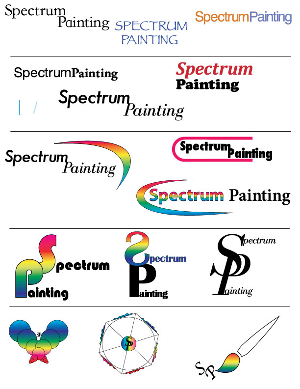
Logo Research Assignment
Logo Research Assignment
By: Nicolas Schroeder
The original Starbucks logo was thought of and created in 1971 when Starbucks was just coming to become a coffee shop. The logo of the Siren creature came from old marine books. The company wanted to capture Seattle's strong seaport roots since the first location was pikes market place. The main reason for the redesign of the logo is to keep Starbucks "relevant." They tried to not loose sight of there heritage during the redesign. The Siren is the heart of Starbucks Coffee. The logo is defined by the siren, it caries a message of the past and tells a story about a coffee company. 

Some of the main elements that define the Starbucks logo are the Siren creature in the center and the color green. The siren has pretty much stayed the same through all the redesigns but the company name has disappeared from the logo. Everyone recognizes the main face in the logo. The color green also stands out a lot and is very distinct. The present day logo fits in the symbol category. There is no type face. The old logos were a combination of a symbol logo with typeface. Starbucks is so well known now that they don't need there name on the logo.
Monday, March 28, 2016
Logo Design Lecture
Logos, Branding, Identity
Brand: Perceived emotional corporate image as a whole, it is the reputation both claimed and perceived.
-brand is essentially their public image
-Create a framework for a brand, colors, fonts but the audience completes the brand through emotional reaction with it.
-Apple is IT company that projects a humanistic image, positive ethics and support of good causes.
Identity: Comprised of the visual aspects that form the brand, close attention is paid to executing a consistant experience for the viewer.
-Identity Design can include the logo, logo variations, labels, advertisements etc.
Logo: Logo is for identification, simplest way a company or organization can represent itself, through the use of a mark or icon
Why Vector Art?: Vector Art is flexible, powerful and easily edited.
-Vector art can be scaled up indefinitely with out loosing quality.
Pencil to Vector: logo design requires many phases. Need graphic style to convert from pencil.
Friday, March 25, 2016


Monday, March 21, 2016
Helvetica The Movie Watching / Writing Assignment:
1.Switzerland
2.Latin for Switzerland
3.1957
4.Modernism
5.Postmodernism, Grunge typography
6. Type designers start with lowercase “h”, The space between type is key, Helvetica is friendly to open interpretation, legibility doesn't always cause communication
Activities:
Since the movie Helvetica all over the place, from posters to street signs. I believe the reason is because it's easy to read and is a good font. Helvetica is sleek, simple, modern and very clean looking.

Think of the font you most commonly use when working on your computer. Which one is it and why do you use that one?
-The font that I use the most would be Arial. The main reason for this is because I have the most experience typing with Arial because its the default font for me. After learning about Helvetica I think I will start using the font more in my everyday life.
1.Switzerland
2.Latin for Switzerland
3.1957
4.Modernism
5.Postmodernism, Grunge typography
6. Type designers start with lowercase “h”, The space between type is key, Helvetica is friendly to open interpretation, legibility doesn't always cause communication
Activities:
Since the movie Helvetica all over the place, from posters to street signs. I believe the reason is because it's easy to read and is a good font. Helvetica is sleek, simple, modern and very clean looking.
2. Wim Crouwel: Graphic Designer https://en.wikipedia.org/wiki/Wim_Crouwel


Think of the font you most commonly use when working on your computer. Which one is it and why do you use that one?
-The font that I use the most would be Arial. The main reason for this is because I have the most experience typing with Arial because its the default font for me. After learning about Helvetica I think I will start using the font more in my everyday life.
Subscribe to:
Comments (Atom)