
Tuesday, June 7, 2016
Friday, June 3, 2016

Monday, May 23, 2016


Monday, May 16, 2016
Tuesday, May 10, 2016


Friday, April 22, 2016

Tuesday, April 12, 2016
Tuesday, March 29, 2016
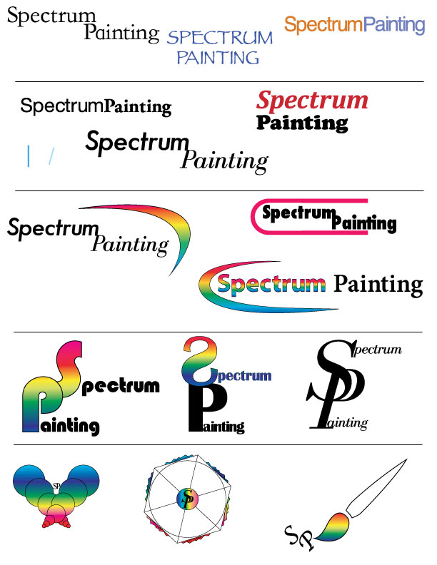
Logo Research Assignment
Logo Research Assignment
By: Nicolas Schroeder
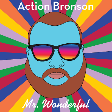
The original Starbucks logo was thought of and created in 1971 when Starbucks was just coming to become a coffee shop. The logo of the Siren creature came from old marine books. The company wanted to capture Seattle's strong seaport roots since the first location was pikes market place. The main reason for the redesign of the logo is to keep Starbucks "relevant." They tried to not loose sight of there heritage during the redesign. The Siren is the heart of Starbucks Coffee. The logo is defined by the siren, it caries a message of the past and tells a story about a coffee company. 

Some of the main elements that define the Starbucks logo are the Siren creature in the center and the color green. The siren has pretty much stayed the same through all the redesigns but the company name has disappeared from the logo. Everyone recognizes the main face in the logo. The color green also stands out a lot and is very distinct. The present day logo fits in the symbol category. There is no type face. The old logos were a combination of a symbol logo with typeface. Starbucks is so well known now that they don't need there name on the logo.
Monday, March 28, 2016
Logo Design Lecture
Logos, Branding, Identity
Brand: Perceived emotional corporate image as a whole, it is the reputation both claimed and perceived.
-brand is essentially their public image
-Create a framework for a brand, colors, fonts but the audience completes the brand through emotional reaction with it.
-Apple is IT company that projects a humanistic image, positive ethics and support of good causes.
Identity: Comprised of the visual aspects that form the brand, close attention is paid to executing a consistant experience for the viewer.
-Identity Design can include the logo, logo variations, labels, advertisements etc.
Logo: Logo is for identification, simplest way a company or organization can represent itself, through the use of a mark or icon
Why Vector Art?: Vector Art is flexible, powerful and easily edited.
-Vector art can be scaled up indefinitely with out loosing quality.
Pencil to Vector: logo design requires many phases. Need graphic style to convert from pencil.
Friday, March 25, 2016


Monday, March 21, 2016
Helvetica The Movie Watching / Writing Assignment:
1.Switzerland
2.Latin for Switzerland
3.1957
4.Modernism
5.Postmodernism, Grunge typography
6. Type designers start with lowercase “h”, The space between type is key, Helvetica is friendly to open interpretation, legibility doesn't always cause communication
Activities:
Since the movie Helvetica all over the place, from posters to street signs. I believe the reason is because it's easy to read and is a good font. Helvetica is sleek, simple, modern and very clean looking.

Think of the font you most commonly use when working on your computer. Which one is it and why do you use that one?
-The font that I use the most would be Arial. The main reason for this is because I have the most experience typing with Arial because its the default font for me. After learning about Helvetica I think I will start using the font more in my everyday life.
1.Switzerland
2.Latin for Switzerland
3.1957
4.Modernism
5.Postmodernism, Grunge typography
6. Type designers start with lowercase “h”, The space between type is key, Helvetica is friendly to open interpretation, legibility doesn't always cause communication
Activities:
Since the movie Helvetica all over the place, from posters to street signs. I believe the reason is because it's easy to read and is a good font. Helvetica is sleek, simple, modern and very clean looking.
2. Wim Crouwel: Graphic Designer https://en.wikipedia.org/wiki/Wim_Crouwel


Think of the font you most commonly use when working on your computer. Which one is it and why do you use that one?
-The font that I use the most would be Arial. The main reason for this is because I have the most experience typing with Arial because its the default font for me. After learning about Helvetica I think I will start using the font more in my everyday life.
Monday, March 14, 2016

Thursday, March 10, 2016

Monday, March 7, 2016
Design Typography Notes
"fonts are the clothing that out ideas wear."
- Legibility: choose classical time-tested typefaces
Helvetica, Times New Roman, Palatino, Baskerville
- Serif vs Sans Serif: Serif reads best at smaller sizes, can be complementary
- Font Variance: Too many fonts confuse the reader
- Definition: Fonts that are too similar cause ambiguity
- Readability: Use UPPER and lower case letters for optimum clarity
- Alignment: Left alignment reads easiest, consider eye flow as it moves down a page
- Emphasis: Use these tools with discretion and without disturbing eye flow
- Integrity: Avoid stretching or distorting type
- Weight: Strive for a sense of balance
- Kerning: Spacing between the letters
Thursday, March 3, 2016

Short Writing Assignment
- Three primary colors are red, green and blue.
- Secondary colors are a combination of two primary colors. ex: Green + Red = Yellow
- Tertiary colors are the resulting color formed when an equal amount of a primary and a secondary color are mixed.ex: Red + Yellow = Orange
- Subtractive colors are colors mixed using pigment while Additive is combining colors using just light.
- Color effects our perception of things, emotions and behavior. Colors reach people on a subconscious level and deliver just as strong of a message as written content does. Companies use psychology of colors to establish and reinforce the desired experience.
- Colors side by side interact with one another and change our perception in different ways, its called simultaneous contrast. Since we don't see isolated colors much contrast affects our sense of the color that we see.
 |
| Grayscale |
 |
| Complementary Colors |
 |
| Monochrome |
Wednesday, March 2, 2016

Monday, February 29, 2016
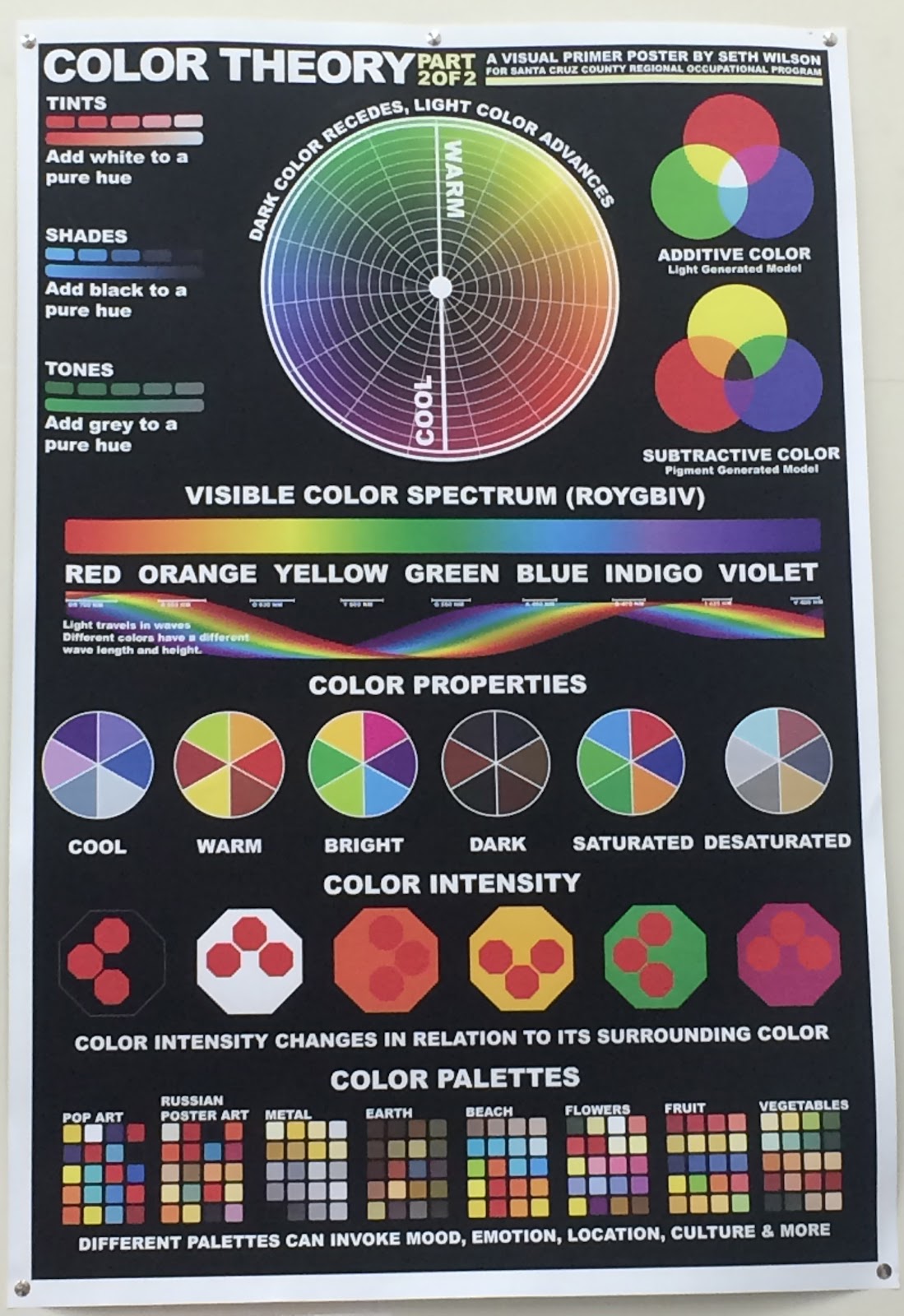
Color Theory
Design
- You see ROYGBIV because its the visual color spectrum
- Pigment generated model is: Red, Yellow, Blue
- Light generated colors: Red, Green, Blue
- Pigment generated is lighter and light generated is brighter
Color Mixing
- RGB: light generated model
- RGY: pigment generated model
- CMYK: print process model
Color modes
- Monochrome: tints, shades and tones of single hue
- Gray scale: black and white only
- Web safe RGB
Color Modification
- Tints: Add white to pure hue
- Shades: add black to pure hue
- Tones: Add gray to pure hue
Color Harmony
- Complementary colors opposite of each other on color wheel
- Split complementary
- Analogous colors are next to each other
- Triad: triangle in a color wheel
- Tetradic: rectangle in color wheel
- Quadrilateral: square in color wheel
Color Properties
- Cool,Warm, Bright, Dark, Saturated, Desaturated
- Color intensity changes in relation to its surrounding color
- Color associations are generated from different cultures
- Color increases brand recognition by 80%
- Pink is a tranquilizing color
Friday, February 26, 2016

Tuesday, February 23, 2016
Design: The Principals and Elements
What's Graphic Design?
- Design elements are the basic units of a visual image.
- Govern the relationship of the elements used and organize the composition as a whole.
- All imagery is comprised of elements that can be broken down and analyzed.
Design Elements
- Space- Gives design dimension and depth, can exist in two or three dimensions. Can refer to a positive or negative space, can refer to foreground mid or background elements.
- Line- Basic element, it can vary in thickness, texture, direction.
- Color- Can invoke mood or sense of time.
- Shape- Inorganic, Organic or Geometric shapes.
- Texture- You can imply texture or actually have texture.
- Value- Light and dark values of an image and all gradients in between, adds depth, contrast.
- Balance- Paying attention to visual weight of elements in design. Must pay attention to the visual weight.
Design Principals
- Unity- Creates sense of order, a consistency in size and shape. Proximity can create a sense of unity, it can also show a lack of unity.
- Variety- Elements in design work that are repeating but not similar, differences in repetition.
- Repetition- Can have repetition without variety, used to enhance meaning.
- Harmony- Similar elements throughout a work so everything supports each other.
- Proximity- Gives design work a informational hierarchy.
- Proportion- Things that are set equal to each other.
- Functionality- Something that has a purpose and delights the viewer.
- Emphasis- Helps make something stand out from rest.


Subscribe to:
Posts (Atom)